A Complete Tutorial to Susy (Part 2)
We have gone through the absolute basics to Susy in the previous week and looked at how to create complete layout grids simply just by using the span column mixin.
In this post, we’re going to explore other parts of Susy that lets you easily push or pull your content block left or right. I’ll also share with you how responsiveness is built straight into the Susy framework.
Lets begin by looking at some of the padding and margins mixins available to us.
Important Update
Susy 2 is now released, which makes this tutorial obsolete. Head over here to find the latest article on Susy 2 instead.
Margin and Padding Mixins
Margin and padding mixins from susy lets you adjust your content by the number of columns before or after your content.
Say for example I wanted to create a design like this.
In our previous tutorial, this wasn’t possible because we didn’t explore the margin and padding mixins.
You can now use either margin or padding to produce the desired effect like this:
.ag1 {
  display: none;
}

.ag2 {
  @include pre(2, 10);
  // @include prefix(2,10);
  // pre adds two columns of margins while prefix adds two columns of padding.
}
The synxtax to use pre() and prefix() are exactly as the same as the synxtax used for span-columns(). It should be easy for you to play around with margins and paddings to produce the desired effect.
The other useful mixins are:
.margin-mixins {
  @include post (2, 10); // Adds two columns of margins after the element
  @include squish(2, 2, 10); // A shortcut to do both pre and post. This adds two columns of margins before AND after the element
}

.padding-mixins {
  @include suffix (2, 10); // Adds two columns of padding after the element
  @include pad(2, 2, 10); // A shortcut to do both prefix and suffix. This adds two columns of padding before AND after the element
}
A full list of mixins are available on the Susy Reference page. Most of the references were words and I found it difficult to understand at first, which is why I wrote this portion since some examples were great to illustrate these documentations.
Now that you’re able to manipulate your website to suit whatever grid columns you want, lets dive into the reponsive parts with Susy.
Creating Responsive Websites with Susy
The whole purpose for using Susy was to create responsive websites real easy, and what we’ve learnt from the previous sections have helped prepare us to understand how Susy works with responsive design. After this part, you’ll be building responsive websites effortlessly!
To make our website responsive, we have to revisit the base configuration section of Susy, and make some adjustments to our existing code from our last tutorial.
Understanding Media Layouts
Susy supports optional arguments in its media layout options and that given as follows:
$media-layout: <min-width> <layout> <max-width> <ie-fallback>;Of these, only min-width or layout are required. Susy will compile all other arguments and label them correctly in CSS Media queries when compiled. A reference of how to use Susy media layouts are found here
Configuring Media Layouts
Susy uses the mobile first concept, so we have to firstly adjust the number of columns to fit on a mobile screen. We’ll also define $med and $large to use for tablet and desktop screens respectively.
// Configuring Susy defaults
$total-columns: 4; // Switching total columns from 10 to 4.
$column-width: 4rem;
$gutter-width: 1rem;
$grid-padding: 0;

$med: 8;
$large: 10;
// 4, 6 and 10 here refers to the number of columns Susy will use.
Using Media Layouts
Since we’ve already configured the layouts, its now the time to use them.
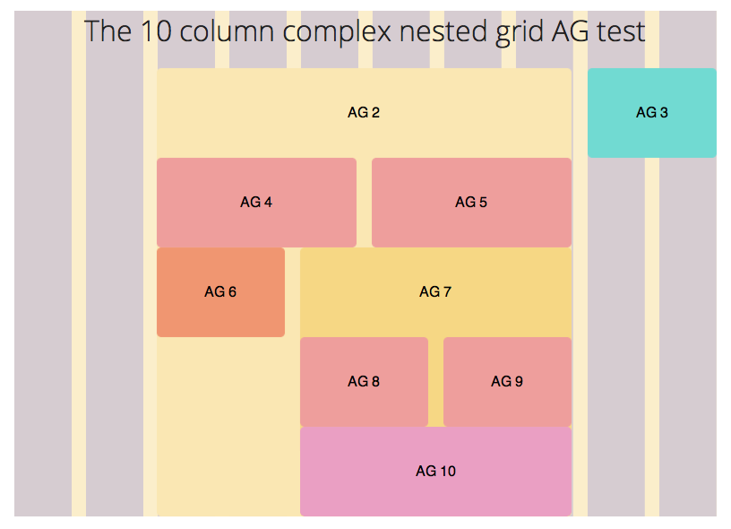
Let’s say we’re modifying our 10 Grid Column test from the last tutorial. We want to show only the middle columns on a mobile device, middle and right column on a tablet and the 10 grids once enough space is available. Check out this demo for a visual representation of what we’re going to create over here.
This can be done with the help of a the $at-breakpoint() mixin.
One of the first problems I encountered while using Susy to do responsive designs was that I couldn’t manage to find out why my layout differs so greatly from the susy background. After pulling my hairs out for over a week, I found the solution. You have to tell Susy to reset the grid background at every breakpoint.
.container {
  @include container($total-columns, $med, $large);
  // Inserting media layouts into container tells Susy that we have 3 different grids that we want to use at different sizes, and Susy should output them as requested when the at-breakpoint mixin is called.
  // Feel free to comment out all Susy grid backgrounds if you don't need them.

  @include susy-grid-background;
  // Everything without a at-breakpoint mixin will show up with $total-columns layout.

  @include at-breakpoint($med) {
    @include susy-grid-background;
    // Switching up susy grid background when layout changes
  }

  @include at-breakpoint($large) {
    @include susy-grid-background;
    // Switching up susy grid background when layout changes
  }
}
The setup is now ready and we’re all packed up and ready to roll!
Creating the layouts
We’re going to create the layout mentioned above and in this demo. Let’s take a look at the code and I’ll explain along with it. Since I want to make this tutorial short and easy to go along with, I’m going to neglect accessibility issues and remove the display of our sidebars when we wont want it around.
.ag1 {
  display: none;
  // removes the left sidebar

  // Tells Susy that this portion should be used only in the large media query
  @include at-breakpoint($large) {
    display: block;
    // shows the left sidebar at the $large layout
    @include span-columns(2, 10);
  }
}

.ag2 {
  // small layout
  @include span-columns(4, 4);
  overflow: hidden;

  // medium layout
  @include at-breakpoint($med) {
    @include span-columns(6, 8);
  }

  // large layout
  @include at-breakpoint($large) {
    @include span-columns(6, 10);
  }
}

.ag3 {
  // small layout
  display: none;

  // medium layout
  @include at-breakpoint($med) {
    display: block;
    @include span-columns(2 omega, 8);
  }

  // large layout
  @include at-breakpoint($large) {
    @include span-columns(2 omega, 10);
    // notice we don't need a display:block here because changes cascade from small to large in Susy. Since display block is declared in the medium layout, the large layout will have the display:block property through inheritance.
  }
}
Conclusion
That’s really all you need to use Susy effectively. With Susy in your toolbelt, your CSS and HTML are now truely separate and you can easily switch up your styles without even touching any part of the HTML?
Its a great win for doing lesser math, another great win for easy responsiven designs and a final one for decoupling HTML from CSS dont you think?
Feel free to look at the demo again or grab the source codes!
View Demo
Download Source