The main challenge of building an Astro-first component library
I’ve put in months of work into Splendid UI by now, and I realised how difficult it is to create an Astro-first component library.
The hardest part is designing the usage API.
Let’s take a popover as an example.
Popovers are simple. Most of the time, there are two elements you need to take care of:
- The popover trigger
- The popover content
There are three ways we can build an API to use a popover:
- With slots
- With an enclosing parent component
- Create a component for each element
<!-- Method 1: Using slots -->
<Popover>
  <div slot="trigger"> ... </div>
  <div slot="content"> ... </div>
</Popover>

<!-- Method 2: Enclosing parent element -->
<Popover>
  <PopoverTrigger> ... </PopoverTrigger>
  <PopoverContent> ... </PopoverContent>
</Popover>

<!-- Method 3: Separate components -->
<PopoverTrigger> ... </PopoverTrigger>
<PopoverContent> ... </PopoverContent>
I’ve settled on using the 3rd method for components in Splendid UI after much testing. Below is a story on how I reached this decision.
Complexities arise when hydrating components
Since I want Splendid UI to work with Astro’s island architecture, each component in Splendid UI must be hydratable right from an astro or mdx file.
This means the Popover component can look like these when it’s used:
<!-- Method 1: Using slots -->
<Popover client:load>
  <div slot="trigger"> ... </div>
  <div slot="content"> ... </div>
</Popover>

<!-- Method 2: Enclosing parent element -->
<Popover client:load>
  <PopoverTrigger client:load> ... </PopoverTrigger>
  <PopoverContent client:load> ... </PopoverContent>
</Popover>

<!-- Method 3: Separate components -->
<PopoverTrigger client:load> ... </PopoverTrigger>
<PopoverContent client:load> ... </PopoverContent>
I felt the first method (with slots) looked the best at first since I only had to use one client directive. Unfortunately, slots turned out to be a really bad idea.
Slots are a really bad idea because Astro handles slots differently from Svelte
I built most of my components on Svelte so this was a major factor. With the same HTML (below), Astro and Svelte produce slightly different results:
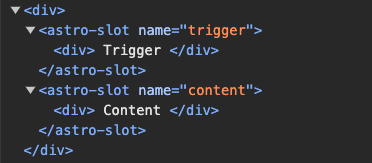
<!-- Astro -->
<Popover client:load>
<div slot="trigger"> ... </div>
<div slot="content"> ... </div>
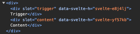
</Popover><!-- Svelte -->
<Popover>
<div slot="trigger"> ... </div>
<div slot="content"> ... </div>
</Popover>Astro produces HTML that contains the contents within an <astro-slot> element, while Svelte produces HTML directly.
I could use Fragment instead of div to produce better-looking HTML, but this produces a different HTML compared to Svelte’s as well.
<!-- Astro -->
<Popover client:load>
  <Fragment slot="trigger"> ... </Fragment>
  <Fragment slot="content"> ... </Fragment>
</Popover>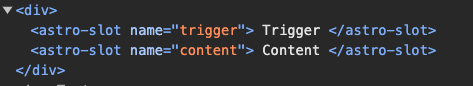
Users will likely use Splendid UI components in both Astro and Svelte files. The difference in HTML is not acceptable — it’ll be confusing when styling the component.
So I’m left with two options:
<!-- Method 2: Enclosing parent element -->
<Popover client:load>
  <PopoverTrigger client:load> ... </PopoverTrigger>
  <PopoverContent client:load> ... </PopoverContent>
</Popover>

<!-- Method 3: Separate components -->
<PopoverTrigger client:load> ... </PopoverTrigger>
<PopoverContent client:load> ... </PopoverContent>
As I searched around the web for inspiration, I decided to try the second method (enclosing parent element).
Enclosing elements in a parent component worked, but it’s not a great idea
Method 2 looks ugly at first glance since we have to hydrate the component three times, but there’s a way to hydrate everything once.
All we have to do is use the component in a svelte file and hydrate that svelte file. For example, say I have a <Nav> with lots of popovers, I can do it like this:
<!-- page.astro -->
<Nav client:load/>
<!-- Nav.svelte -->
<Popover>
<PopoverTrigger> ... </PopoverTrigger>
<PopoverContent> ... </PopoverContent>
</Popover>
<Popover>
<PopoverTrigger> ... </PopoverTrigger>
<PopoverContent> ... </PopoverContent>
</Popover>I liked this method because I get to be lazy when I create the Popover — I can depend on <Popover> to find both <PopoverTrigger> and <PopoverContent>, so I don’t have to link them up with an id attribute or something similar.
<!-- Method 2 doesn't require me to specify the targets  -->
<Popover>
  <PopoverTrigger> ... </PopoverTrigger>
  <PopoverContent> ... </PopoverContent>
</Popover>

<!-- Method 3 requires me to specify the target -->
<PopoverTrigger target="one"> ... </PopoverTrigger>
<PopoverContent id="one"> ... </PopoverContent>
But I later realized two major downsides that led me to choose method 3 instead.
The first downside is I couldn’t use Svelte’s Context API to pass information from <Popover> into <PopoverTrigger> and <PopoverContent> if I hydrated them separately.
That’s because each component is hydrated in isolation so they won’t be able to inherit context.
This also meant the component could not be used in an astro file — which violates the Astro-first principle. (It was painful to discover this since I had to rewrite my code to support the 3rd method).
<!-- You cannot use context when doing this -->
<Popover client:load>
  <PopoverTrigger client:load> ... </PopoverTrigger>
  <PopoverContent client:load> ... </PopoverContent>
</Popover>
The second downside is the API isn’t user-friendly even if we hydrate it once — it creates confusion instead.
To illustrate this point, imagine I have a navigation that contains 3 items. Each item is a button that shows more items.
If I used Method 2, the HTML would look like this:
<!-- Nav.svelte -->
<nav>
  <ul>
    <li>
      <Popover>
				<PopoverTrigger> ... </PopoverTrigger>
				<PopoverContent> ... </PopoverContent>
			</Popover>
    </li>

		<li>
      <Popover>
				<PopoverTrigger> ... </PopoverTrigger>
				<PopoverContent> ... </PopoverContent>
			</Popover>
    </li>

    <li>
      <Popover>
				<PopoverTrigger> ... </PopoverTrigger>
				<PopoverContent> ... </PopoverContent>
			</Popover>
    </li>
  </ul>
</nav>
This looks okay at first glance. But I was taken aback when I tried to refactor the code — I couldn’t immediately grasp what <Popover> was; my mind was looking for a <button> element instead (which can be represented by the PopoverTrigger element).
By merely removing the <Popover> container, the navigation immediately made much more sense.
<!-- Nav.astro -->
<nav>
  <ul>
    <li>
			<PopoverTrigger client:load> ... </PopoverTrigger>
			<PopoverContent client:load> ... </PopoverContent>
    </li>

		<li>
			<PopoverTrigger client:load> ... </PopoverTrigger>
			<PopoverContent client:load> ... </PopoverContent>
    </li>
  </ul>
</nav>
This is why I went with method 3.
The best API I could think of
The best API I could think of is Method 3 — where I create a separate component for each element. Then I would link them up together with an id attribute or something similar.
<PopoverTrigger target="one"> ... </PopoverTrigger>
<PopoverContent id="one"> ... </PopoverContent>
Contrary to my expectations, I encountered two major challenges while building this API too. They are:
- Deciding how options should be passed into the component
- Linking the components up
Deciding how options should be passed into the component
If I used the second method, I could pass all the options into the enclosing parent component and call it a day. Easy peasy.
<!-- I could do this if I used method 2 -->
<Popover options={{ ... }}>
  <PopoverTrigger> ... </PopoverTrigger>
  <PopoverContent> ... </PopoverContent>
</Popover>
Unfortunately, that’s not possible in Method 3.
I had to decide between three options:
- Pass all options into
PopoverTrigger - Pass all options into
PopoverContent - Split options between these two components.
I eventually decided to split the options into <PopoverTrigger> and <PopoverContent> because it made more sense.
So the API became like this:
<PopoverTrigger options={{ ... }} client:load> ... </PopoverTrigger>
<PopoverContent options={{ ... }} client:load> ... </PopoverContent>
To give you more context, you can pass many into Popover (and other components). I built these options to give you flexibility when using them.
Here’s an example of the options you could use:
export const defaultPopoverTriggerOpts = {
  showOnHover: false,
  showOnFocus: false,
  hoverCloseDelay: 120,
  closeOthers: true,
}

export const defaultPopoverContentOpts = {
  placement: 'top',
  arrow: true,
  arrowWidth: '0.5rem',
  offset: '0.25rem',
  closeOnOutsideClick: true,
  closeOnEscapeButton: true,
  trapFocus: false,
}
Separating options into two components means I have to change the way I write documentations. They had to be clearer so it’s not confusing for users. That’ll be the next challenge I have to overcome.
Linking components up was hard
You would expect linking up two components would be easy. After all, they’re hydrated one after another. Right?
<PopoverTrigger client:load> ... </PopoverTrigger>
<PopoverContent client:load> ... </PopoverContent>
Turns out, it was hard because the components are hydrated asynchronously — I have no idea which would be hydrated first.
I eventually found a way to overcome this problem by initializing components into a store and overwriting options as necessary. I shall not dive into the technical details here since it can be quite complex and unnecessary for users.
Wrapping up
Phew, this turned out to be a long article explaining how I went about designing the APIs for Splendid UI.
As I build Splendid UI, I find myself respecting framework authors and library authors more because this kind of work is really complex.
At the same time, I feel incredibly fortunate that I’m building Splendid UI, because I get to create the perfect library for frontend developers who pay attention to both design and accessibility.